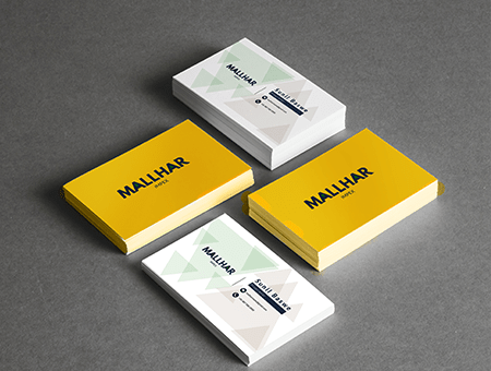
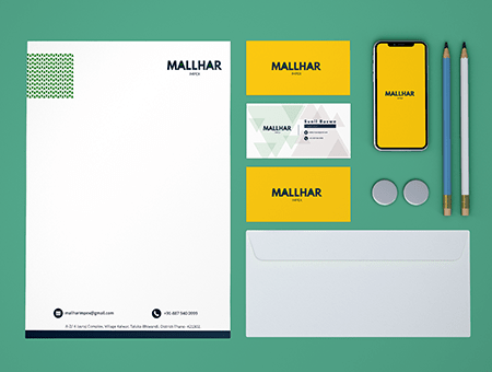
| Mallhar Impex is an upcoming business that required a logo and the subsequent marketing collateral that met the requirements of spirituality and Vaastu. Being an Indian company, the business laid its foundation on these Hindu core values and desired to be represented by the Leo zodiac sign. The logo had to reflect the courageous value of a lion, represent the primary function of the business, have an earthy touch, and delineate a harmonious process. |
All these conditions were complied with through our creation and design of a letterhead that embraced a dense green colour coupled with two arrows that represented their main form of business. The logo was simple and easy to perceive which the vital objective was. Since the firm was named after the star sign Leo, we inculcated yellow in our secondary palette and followed the same graphic elements. |